1 Introduction
Objectives
In this module, you will:
- Expand your understanding of the social determinants of health and equity
- Learn how spatial data visualizations are used in public health
- Define four main types of web mapping applications
By the end, you should have an idea of which type of spatial data visualization type you plan to work with for your project.
Think of spatial data visualizations as your bridge to meaningful conversations in public health. Nevertheless, crafting insightful maps, dashboards, or other spatial representations can be challenging, due to both technical and methodological hurdles. The path to creating an effective spatial data visualization does not commence with software usage; rather, it initiates with stakeholder meetings, annotations, and sketches. Therefore, a objective of this toolkit is to encourage you to invest time in thinking about your potential visualization and considering the individuals who will reap its benefits.
Annotations, sketches, and meeting summaries can be handwritten in a notebook or digitally generated on a computer. We recommend creating a journal for this toolkit to annotate and store your notes. Your toolkit journal will assist you in organizing your thoughts, creating new content, making sketches, saving code, writing notes from meetings, and reflecting on your mapping process. Indeed, the production of relevant visualizations related to SDOH is a lengthy and complex process that requires creativity, organization, and technological skills. Your journal can be an invaluable companion on your journey.
Tools
For this toolkit, you need your toolkit journal:
- Notebook and writing utensil or
- Note-taking or sketching app (if you prefer digital annotations)
Some of our team members prefer drawing on post-it notes, tablets, digital apps, or wall-sized pieces of paper. Take your pick and go with it!
1.1 SDOH & Place
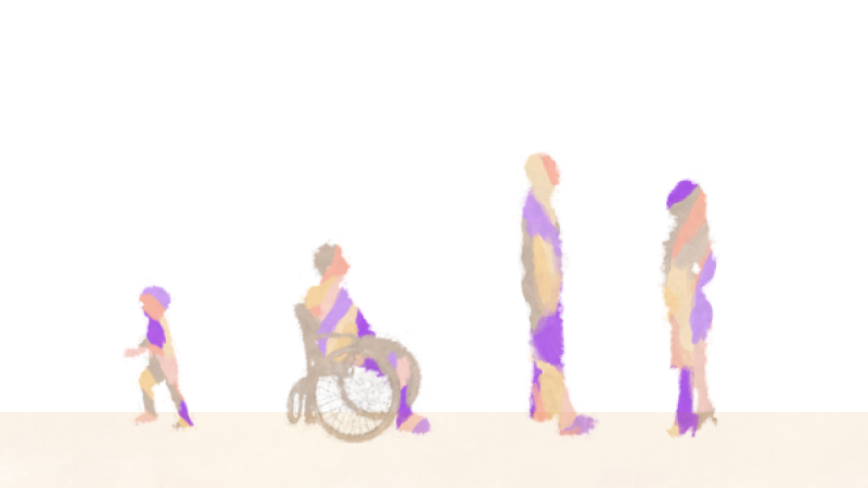
When we talk about the factors that shape our health, it’s not just about biology or lifestyle — it’s about where we live and the complex tapestry of history, society, and economy that frames our lives. The social determinants of health (SDOH) encompass a range of historical, social, cultural, political, and economic factors that significantly impact the well-being of individuals and their communities. These SDOH aren’t just statistics; they’re stories of communities and the places we call home, varying from one street to the next. They’re about whether we have parks over parking lots, fresh food on shelves, and whether our neighborhoods are marked by support or segregation.
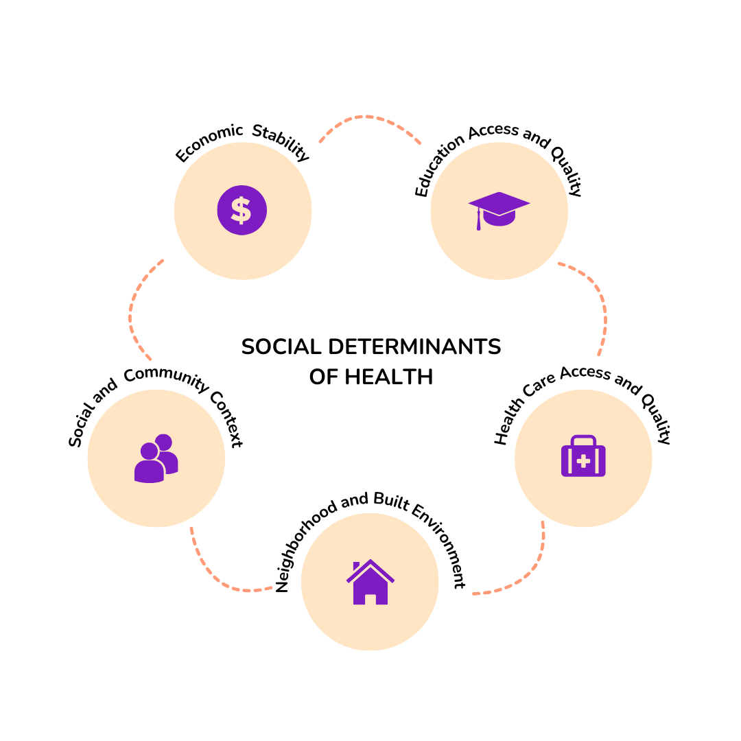
The social determinants of health are complex and exist at many different scales — the individual, interpersonal, community, and regional levels. In this toolkit, we focus on how the SDOH emerge at community and regional levels. For example, neighborhoods will have differing availability of fresh produce, community clinics, and job opportunities, impacting how residents are able to successfully eat healthy, visit health providers, and afford housing essentials. By using neighborhood or regional scales of data to approximate SDOH, we can begin to get a deeper sense of the complex environment in which people live, work, and play. When working with measures at neighborhood-levels, a spatial view is essential to enable us to work with the data, from data wrangling to visualization and analysis. A neighborhood-view of SDOH is multidimensional, and can predict over 60% of premature deaths.
Academics, activists, government agents, and policymakers have employed data visualizations to examine the connections between places and SDOH. For example, they have utilized dashboards to study the impact of COVID-19 on vulnerable communities. They implemented participatory mapping to advocate for policy-based interventions, and deployed story maps to promote health initiatives. To produce these data visualizations, health researchers and advocates mobilize a wide array of conceptual frameworks and diverse technical skill sets. Moreover, data visualizations in public health do not only analyze the relationship between places and SDOH. They promote health equity: “a state in which everyone has a fair and equitable opportunity to achieve their highest level of health” (CDC’s Office of Health Equity, 2022).
1.2 Centering Equity
The concept of equity in public health data visualizations goes beyond mere stylistic enhancements to aid in comprehension or research. It extends to encompass connections to pertinent resources and diverse language option. For example, empowering communities with information, processes, and agency to transform neighborhoods and social structures towards healthier systems.
Let’s dive deeper into how we can make data visualizations not just informative, but also inclusive and impactful. It’s not all about graphs and numbers. By weaving in stories and multimedia—like videos and interactive media streams—we open up a world where data talks to everyone, not just to those who love statistics.
Imagine a dashboard that not only shows you the trends but also tells you the stories behind the numbers. It’s designed with real people in mind, adapting to a variety of preferences—whether you’re someone who loves a good narrative or someone who digs deep into the data.
However, we’ve got to acknowledge that sometimes, our public health systems fall short. They miss the mark on painting the full picture of health disparities. That’s why, when we’re talking about Place & SDOH, we need to put equity at the heart of our work—from the word go, right through to the final pixel of the design. It’s not just a ‘nice-to-have’; it’s a must-do for visualizations that truly resonate with and serve all communities.
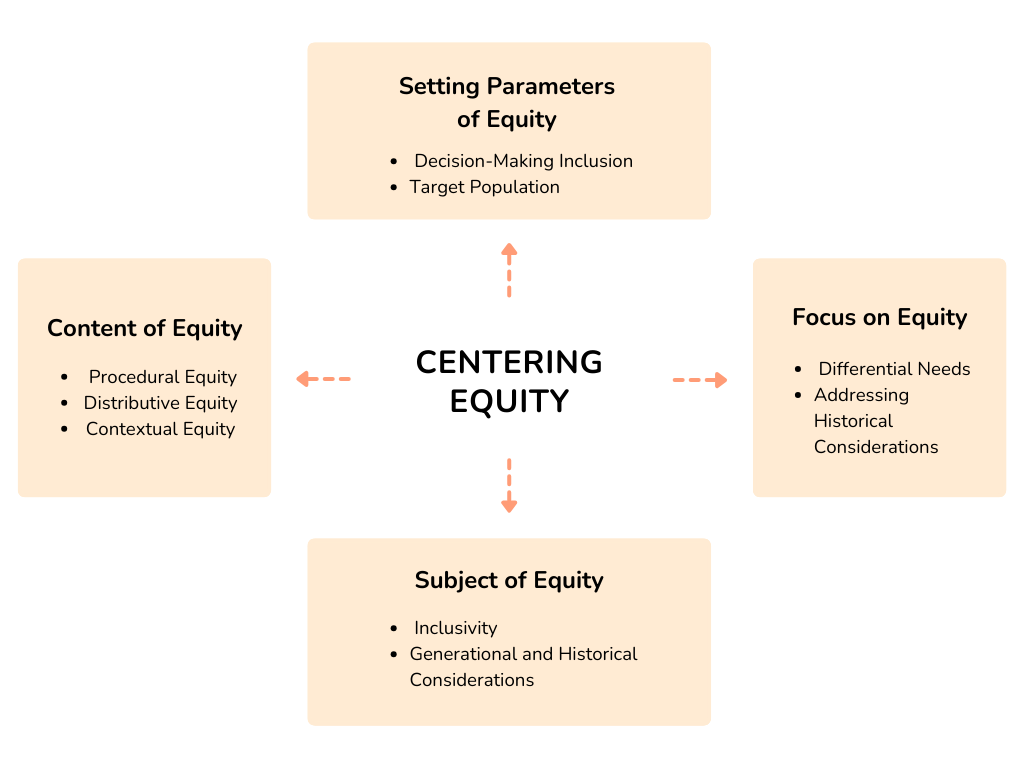
Equity Orientation
The equity orientation in a public health data system involves several key components that must be outlined to address health disparities and promote equitable outcomes effectively.
These components include:
Setting Parameters of Equity:
- Decision-Making Inclusion: The process of setting parameters for equity should involve diverse stakeholders, including representatives from marginalized communities, to ensure that the perspectives and needs of all affected populations are considered.
- Target Population: It is crucial to identify the specific populations and communities that are the focus of efforts to improve equity. This includes recognizing vulnerable groups that historically experience disparities in health outcomes.
Focus on Equity:
- Differential Needs: An equity-oriented approach acknowledges that different populations have varying needs and histories. It recognizes the importance of tailoring interventions to address these disparities rather than assuming that a one-size-fits-all approach will be sufficient.
- Addressing Historical Considerations: An equity-oriented system acknowledges historical injustices and systemic discrimination that have contributed to current health disparities. It seeks to redress these past injustices and provide opportunities for affected communities to improve their health and well-being.
Subject of Equity:
- Inclusivity: The subject of equity encompasses all individuals and communities facing health disparities, including marginalized and underserved groups.
- Generational and Historical Considerations: An equity-oriented data system takes into account intergenerational and historical factors that have contributed to health disparities. It recognizes that current health outcomes are influenced by past policies and practices.
Content of Equity:
- Procedural Equity: This aspect of equity focuses on ensuring that the decision-making processes and procedures are perceived as fair and transparent. It involves involving affected communities in the planning, implementation, and evaluation of health interventions.
- Distributive Equity: Distributive equity concerns how social welfare and resources are distributed to meet the needs of different populations. It aims to allocate resources in a way that reduces health disparities and provides equitable access to healthcare and other essential services.
- Contextual Equity: This aspect acknowledges that pre-existing social conditions (such as poverty, discrimination, and access to resources) influence equity. An equity-oriented data system considers these contextual factors when designing interventions to address health disparities effectively.
Embracing a Trauma-Informed Mindset in Decision-Making
Adopting a trauma-informed mindset is crucial for creating solutions that are sensitive, empathetic, and inclusive when working in the space of communicating, understanding, and analyzing. Trauma-informed decision-making ensures that your project respects the experiences and well-being of individuals whose data is being visualized. Here are key considerations to guide your decision-making process with a trauma-informed approach:
Understand the Impact of Trauma: Recognize that individuals within your data may have experienced trauma, whether it’s related to health disparities, socioeconomic challenges, or other adverse life events. Understanding the potential impact of trauma allows you to approach your project with empathy and compassion.
Prioritize Safety and Trust: Safety and trust are foundational elements of trauma-informed care. Ensure that your data visualization project creates a safe and trustworthy space for users. This involves transparent communication, data security measures, and a user-friendly interface that minimizes potential triggers.
Promote Choice and Empowerment: Empower users by providing choices in how they interact with and interpret the data. Consider customizable features that allow individuals to tailor their experience based on their preferences. This promotes a sense of agency and control over their engagement with the visualization.
Avoid Re-traumatization: Strive to avoid re-traumatization through your data visualizations. Be mindful of the language used, the visual elements displayed, and the overall tone of your project. Aim to present information in a way that informs without causing distress or harm.
Cultural Sensitivity and Diversity: Acknowledge and integrate cultural sensitivity into your decision-making process. Consider the diverse backgrounds, beliefs, and experiences of the individuals represented in the data. Ensure that your visualizations are inclusive and respectful of different cultural perspectives.
Engage Stakeholders and Communities: Involve stakeholders and communities in the decision-making process. Seek input from those directly impacted by the data being visualized. Community engagement ensures that your project aligns with the real needs and concerns of the people it serves.
Continuous Feedback Loops: Establish continuous feedback loops to gather insights from users and stakeholders. Regularly reassess your decision-making processes in light of the feedback received, allowing for ongoing improvement and adaptation to the evolving needs of the community.
Ethical Data Use and Privacy: Uphold ethical standards in data use and privacy protection. Clearly communicate how data will be used, ensuring transparency and obtaining informed consent when necessary. Respect privacy rights and prioritize the responsible and ethical handling of sensitive information.
By embracing a trauma-informed mindset in decision-making, your SDOH data visualization project can contribute to a more compassionate and understanding approach to public health. This mindset not only enhances the user experience but also promotes a positive impact on the well-being of the individuals and communities represented in the data.
Tip
Consider your audience or who your project will impact. How can you involve them in the entire process of developing and disseminating your project?
- Start by creating a list of people you know that can be included, think about who they can connect you to.
- Ask if they’re willing to contribute some of their time and expertise to help you develop this project.
- View the people your working with as co-creators.
1.3 Dynamic Spatial Visualizations
Visualizing public health data isn’t just about the “what”—it’s about the “so what?” It’s about crafting digital narratives that anyone can access, understand, and use to make a difference. These visual tools are our digital megaphones and meeting places—they bring us together, keep us informed, and push us towards action. Data visualizations in public health that advance equity are digital tools designed to provide accessible and comprehensive data related to public health indicators, focusing on reducing health disparities and promoting equity among different populations. These tools often combine various data sources and visualization techniques to present information in a user-friendly and easily understandable format.
Because of our focus on SDOH & Place at neighborhood and regional levels, we’ll focus on spatial data visualizations. Spatial data visualizations incorporate not just the “regular” data, but in addition, how that data is linked to places. This new dimension of data can be visualized as a map. But another important aspect emerges; with spatial data, we are given the ability to link any data by location. This enables us to integrate the many facets of SDOH and health, converging on place.
Data visualizations can be used by community members and organizations, research groups, policymakers, and more to empower individuals to better access and mobilize SDOH data and advance health equity. Within the realm of public health, maps, dashboards, and interactive web applications can be created to foster fairness through an inclusive design that accommodates diverse user groups and their varying degrees of health equity. These tools are not only visually appealing and easy to comprehend, they also provide valuable insights. They adapt to the needs of different social actors by combining well-suited graphics, animations, and audio-visual elements. They even offer networking tools (e.g., messaging boards) for seamless data exchange and user interaction. These interactive features also serve to promptly update users about any alterations.
Tip
We use the term spatial data visualizations throughout the toolkit. We are focusing on web-based applications that will have some interactions. (In other words, they’re not just pictures.) There are many other names for what we’re talking about, like:
- Web Applications
- Mapping Applications
- Spatial Decision Support Systems
We’re not covering all types of spatial data visualizations, or all web apps, but will focus on common types of web mapping applications.
1.4 Types of (Spatial) Applications
Throughout this module, we’ve concentrated on orienting you to how we talk about SDOH and Place, given you a change to brainstorm ideas, recognize prospective stakeholders, and consider potential data at your disposal for your project. As we progress, we will now examine how these three features converge when it comes to choosing an appropriate spatial visualization. To facilitate this, we will introduce four distinct types of spatial visualizations for communicating about and investigating the social determinants of health: asset maps, thematic maps, story maps, and dashboards.
When comparing spatial visualization options, we’ll focus on two dimensions: 1) map type, and 2) level of data & interaction complexity. For map type, visualizations may be more of a reference or thematic map. A reference map is meant to emphasize information about locations, whereas a thematic map will focus on geographic patterns of a specific topic. Interaction complexity refers to the intensity and variability of user interaction with the visualization. The interactions may involve a click to open an information window, or may require extensive decision-making and careful parameter selection to generate a updated visualization. Data complexity my refer to how many types of data you are incorporating, from different forms of spatial data (e.g. address-level locations, community boundaries) as well as different types of input data (e.g. photos, videos, tabular data). As applications get more complex, you can also have lines blurred across both dimensions.
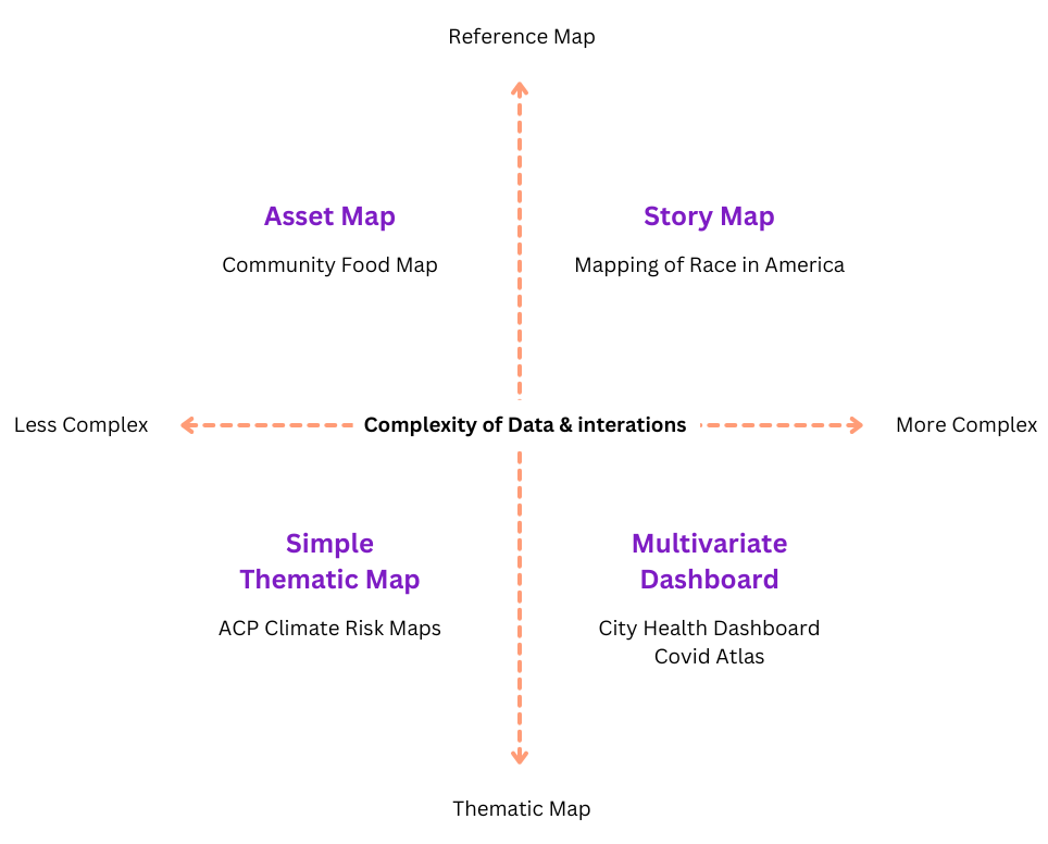
Asset Maps
These are like your community’s highlight reel, showcasing everything from the vibrant parks and schools to the people who make your area tick. They’re about celebrating what’s there, not just what’s missing, and sparking conversations about building on those strengths.
Asset maps act as reference maps and tend towards straightforward interactions, like clicking on an icon to access details about an address. Data-wise, asset maps will start with address-level locations, that will get converted to point data.
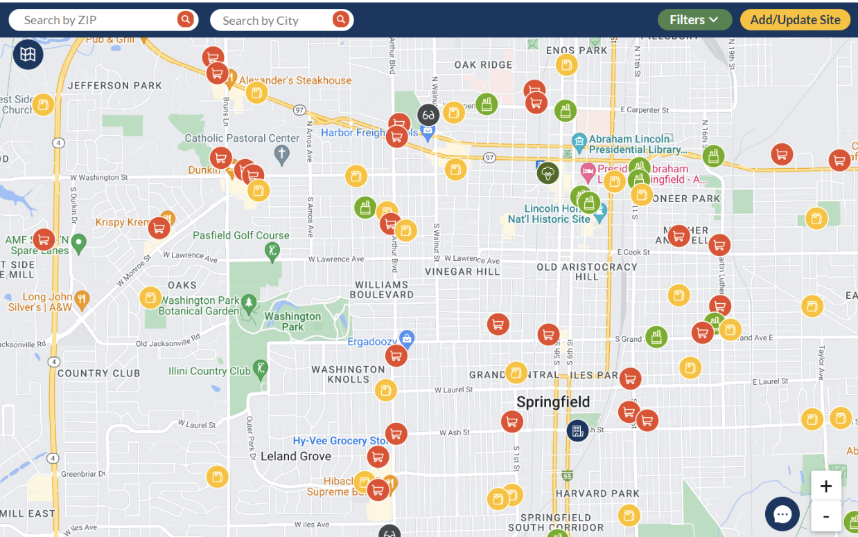
Asset mapping may involve engaging with community members, stakeholders, and local organizations to gather information and collaboratively build the map. The process can be facilitated through surveys, interviews, focus groups, and public meetings. Alternatively, you may link existing data about resources into a newly integrated platform. The resulting asset map is a visual tool that provides a comprehensive view of the community’s strengths, potential partnerships, and areas where support and resources are available. The assets included in an asset map can be diverse and encompass various categories, such as:
Physical Assets: These include tangible resources like parks, schools, hospitals, community centers, libraries, public transportation, and other infrastructure elements.
Human Assets: Human resources within the community, such as skilled individuals, volunteers, community leaders, and organizations’ staff, are valuable assets.
Social Assets: Social assets refer to the networks, relationships, and social capital present in the community, including support systems, cultural groups, and community organizations.
Economic Assets: These include businesses, local enterprises, job opportunities, and other economic resources that contribute to the community’s well-being.
Cultural Assets: The cultural assets encompass the traditions, heritage, arts, and cultural events that enrich the community’s identity and cohesion.
Environmental Assets: Natural resources, green spaces, environmental initiatives, and sustainable practices are considered environmental assets.
Asset Maps empower communities, steer strategic planning, and guide resource allocation. They’re about networking and flipping the script to a more positive community narrative.
Simple Thematic Maps
Here’s where we paint with data, using colors and symbols to show patterns like disease spread or healthcare access across different places. Thematic maps in public health are maps that use visual symbols, colors, and patterns to represent specific health-related data or themes within a geographic area.
Data-wise, thematic maps use area boundaries, like census tracts or counties, referred to as polygon data. Statistical data in CSV formats are merged to spatial data boundaries. Data & interaction complexity remain more simplified, encouraging the user to inspect visualized patterns. Interactions may include selecting different variables for different maps, or clicking on an area to get information in a pop-up window.
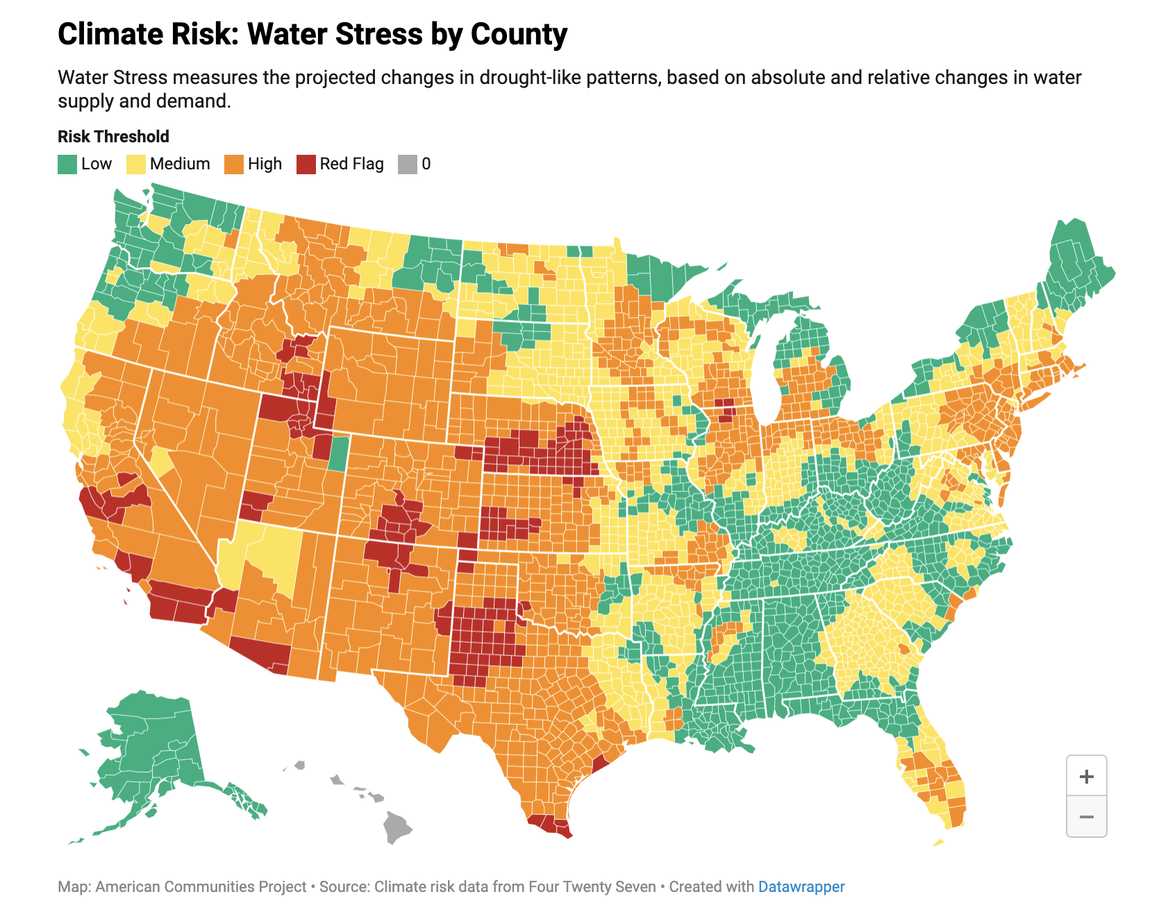
Thematic maps are valuable tools in public health for conveying complex information in a spatial context, allowing researchers, policymakers, and the public to quickly understand and interpret health-related data. Simple thematic maps in public health are used for a variety of purposes, including:
Visualizing disease prevalence and distribution
Identifying health disparities across different regions or demographic groups
Monitoring disease outbreaks and patterns
Assessing access to healthcare services and resources
Evaluating the impact of public health interventions and policies
Communicating public health information to the general public and stakeholders
Simple thematic maps get straight to the point, showing you who and where are affected by health issues, helping to direct attention and resources effectively.
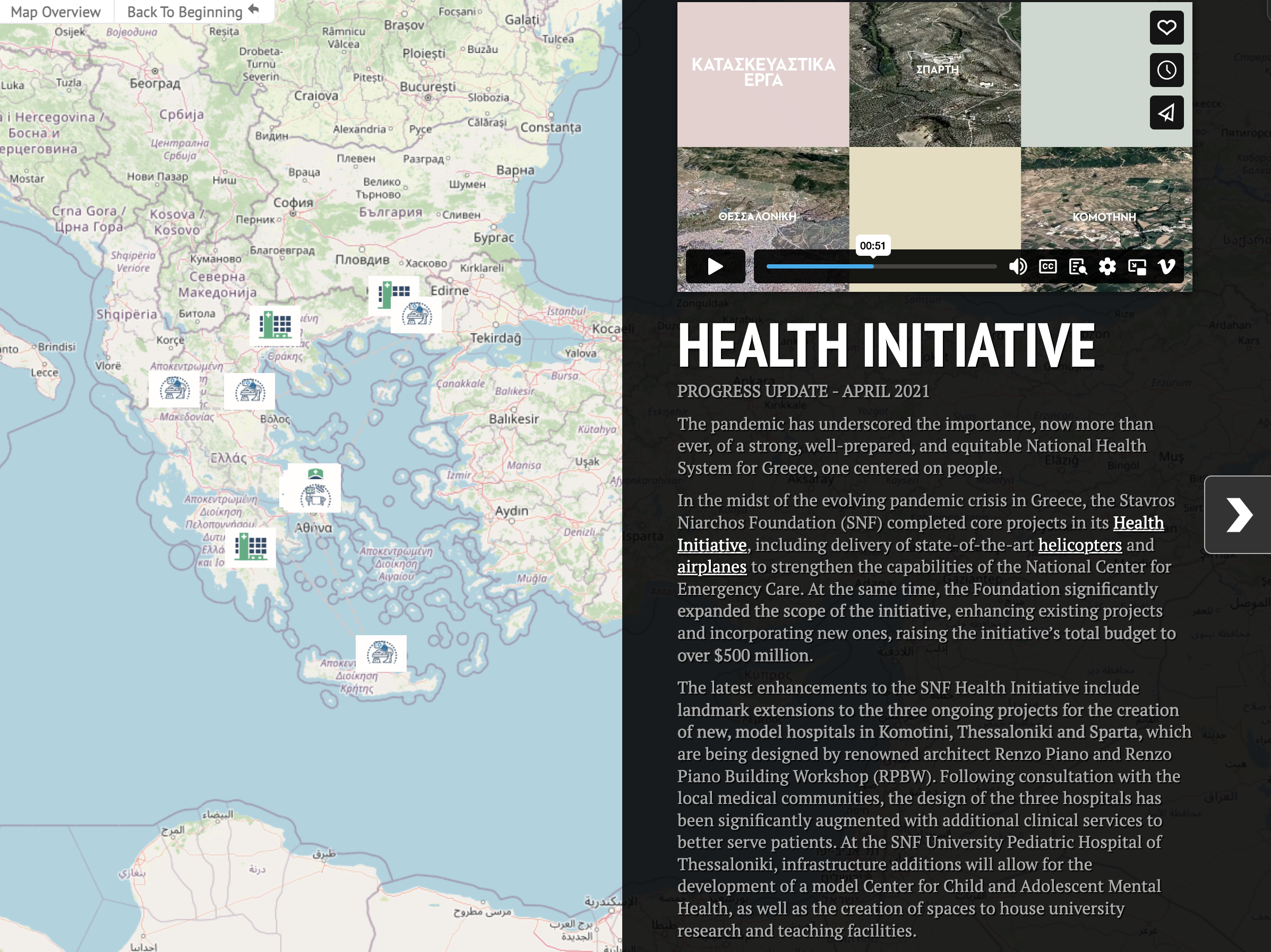
Story Maps
A story map in public health is a powerful and interactive tool that combines maps, text, images, and multimedia elements to tell a compelling narrative about health-related issues, initiatives, or research. Data and interactions may be gorgeously complex, encouraging users to fully imbibe. Different types of spatial data may be used, from point-based locations to regional views.
These are your digital storybooks, weaving maps with tales and images that take you on a journey through health challenges and triumphs. It allows public health professionals to present complex data, trends, and information in a visually engaging and accessible manner, making it easier for a wide range of audiences to understand and connect with the subject matter.
Key features and uses of story maps in public health include:
Data Visualization: Story maps use maps and data visualizations to illustrate health-related trends, patterns, and disparities across geographic regions. This can include disease prevalence, access to healthcare, environmental health risks, and other relevant data.
Narrative Communication: Story maps are structured to present information in a storytelling format. Public health professionals can use narrative elements to explain the context, significance, and implications of the data, helping the audience grasp the larger story behind the statistics.
Health Education and Promotion: Story maps are an effective educational tool to raise awareness about public health issues, promote healthy behaviors, and disseminate health-related information to the public.
Community Engagement: Story maps can engage communities in public health initiatives by presenting data and insights in a way that is relevant and relatable to specific geographic areas or demographics.
Policy Advocacy: Public health professionals can use story maps to advocate for specific policy changes by visualizing the impact of current policies and proposing evidence-based solutions.
Environmental Health: Story maps can be used to communicate information about environmental health hazards, pollution, and their impact on public health. They can also showcase initiatives aimed at improving environmental conditions and public health outcomes.
Outbreak Response and Preparedness: Story maps can be utilized during disease outbreaks to track the spread of infections, identify hotspots, and inform response efforts.
Health Equity and Disparities: Story maps can highlight health disparities and inequities across different communities and populations, drawing attention to areas with the most significant health challenges and the need for targeted interventions.
Story Maps turn data into engaging tales, educate, and rally communities. They’re advocates, educators, and responders all in one.
Multivariate Data Dashboards
Imagine your health community’s stats brought to life in real-time – a dashboard that’s part control panel, part story, helping everyone from officials to neighbors make sense of the numbers. Multiple variables will be integrated across different views, enabling a multivariate experience. Interactions can be complex, requiring user input to change figures or update sliders. Data may also be complex, although will mainly focus on statistical tabular data (rather than multimedia formats).
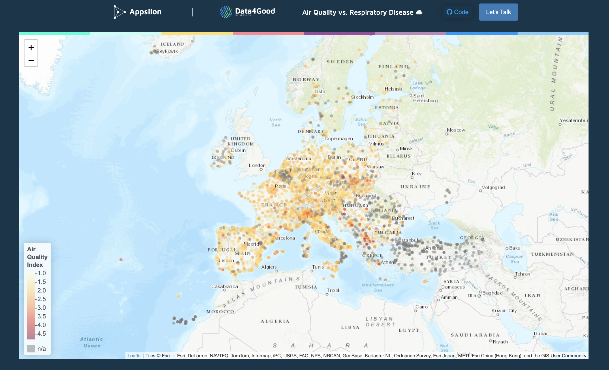
In public health, data dashboards are digital tools that provide visual representations of key health-related data and indicators. Here’s an example of a dashboard that highlights users stories, New Video Series: Moving from Data to Action | City Health Dashboard. These dashboards are specifically designed to present public health data in a user-friendly and easily understandable format, enabling stakeholders, policymakers, researchers, and the general public to access and interpret critical information about population health.

Data dashboards in public health typically include the following features:
Health Indicators: Dashboards display a variety of health indicators, such as disease rates, mortality rates, vaccination coverage, hospitalization rates, environmental health data, and other relevant metrics.
Geospatial Data: Many public health dashboards utilize spatial data to present geostatistical analysis in real-time, allowing users to understand health patterns and disparities across different geographic regions.
Time Series Data: Dashboards often provide data over time, allowing users to observe trends, track changes, and identify seasonal patterns in health outcomes.
Demographic Disaggregation: Public health data dashboards may disaggregate data by demographic characteristics, such as age, gender, race, ethnicity, and socioeconomic status. This helps identify disparities and understand how health outcomes vary among different population groups.
Comparisons and Benchmarks: Dashboards may include the ability to compare health outcomes across regions, states, or countries, as well as against national or global benchmarks.
Data Sources and References: Transparent dashboards typically provide information about the sources of data, data collection methods, and references to ensure data credibility.
Interactivity: Interactive elements allow users to customize the dashboard, apply filters, and explore data based on their specific interests and questions.
Alerts and Notifications: Some dashboards include alerting features to notify users about significant changes in health indicators or emerging health threats.
Spatial Data Dashboards keep a pulse on public health, from tracking diseases to zooming in on health equity. They’re transparent, interactive, and always on the lookout with alerts.
Activity
After exploring the four spatial visualizations (e.g., story maps, thematic maps, dashboards, and asset maps), it is essential to reflect on their advantages and limitations. Create a list of three advantages and three limitations for each of the four visualizations that we reviewed in this module.
For example, you could focus on which visualization is better suited for displaying a place’s historical health trends, analyzing the impact of a pandemic, or explaining the results of a public policy? Which visualization requires some experience with statistics and coding, and which one requires experience with the humanities and storytelling?
Resources
For a deeper dive on topics discussed in this chapter, please check out the following. If you have a resource to add, feel free to suggest one by submitting an issue to our toolkit repository.
- Achieving Health Equity - Robert Wood Johnson Foundation
- Data for Equity: A Review of Federal Agency Equity Action Plans - Leadership Conference Education Fund
- Do No Harm Guide: Crafting Equitable Data Narratives - the Urban Institute
- Common Thematic Map Types - The Geographic Information Science & Technology Body of Knowledge (2nd Quarter 2021 Edition), John P. Wilson (ed.)
- Narrative and Storytelling - The Geographic Information Science & Technology Body of Knowledge (2nd Quarter 2021 Edition), John P. Wilson (ed.)
- GIS&T for Equity and Social Justice - The Geographic Information Science & Technology Body of Knowledge (2nd Quarter 2021 Edition), John P. Wilson (ed.)